

New Week .. New Challenges
Hello, fellow dev wizards! As we embark on another week of coding adventures, I have a confession to make. Last week, I committed some rookie mistakes that would make even a code newbie blush. I'm talking about forgetting to parametrize hyperlinks, using Roboto as an asset instead of relying on the default font in Android, and leaving some debug code in the mix. But hey, we all have to start somewhere, right? Consider me a now slightly less clueless coding padawan. And with those mistakes in the rearview, I'm ready to dive into some new screens and crush them this week. So let's do this thing, and remember: we all make mistakes, but it's how we learn and grow from them that makes us true coding legends.
User Roles
After fixing my last week's mistakes, I was ready to start a new challenge. Since Neoroo is not only designed for the mother (family) but also for nurses to track the baby's vitals and be warned if there's a sign of abnormality in the baby's vitals, so this led to 2 types of users: a family member, or a care provider.
So, before a user authenticates him/herself, a user should first specify whether he/she is a family member or a care provider, because, of course, they both have different views of the app and they track different things with different functionalities.
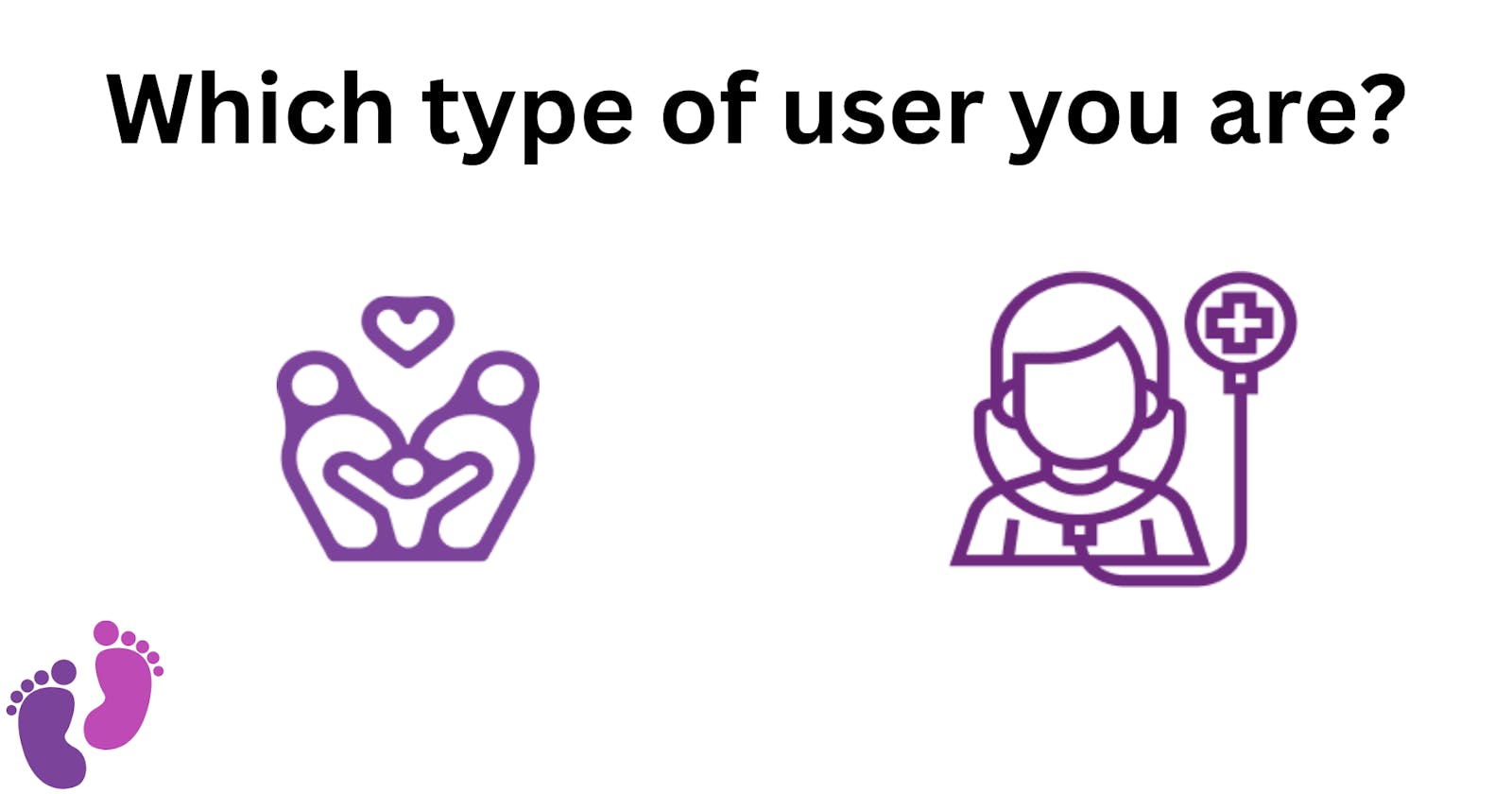
Overview of the design
In the Figma design, there's a separate screen for choosing the user type, that follows the landing screen "remember the landing screen from last week?", the screen UI should look like this

As you can see, it's simple, just 2 buttons each one chooses a different user role.
My Progress This week
so, this week, I've implemented the design of this screen and things were easier than the previous week as I've already implemented the main button and reused it in this screen, just had to put it in a stack where I can put the user role icon above it, and finally, I've added the Neroo logo title and wrapped all in a column with vertical space between them. here's a final screenshot of the real implemented app "taken from my phone"

Also, since this screen didn't require much time from me, I started working on the authentication screen by implementing the most basic component in it "The input text field ⌨️", and also some other small components. well, I won't spoil that now till the next week's post, so stay tuned 😉
Conclusion
And that's a wrap for week 2 of coding! After some silly mistakes last week, I'm happy to say that I've bounced back and tackled a new challenge - implementing a user-type selection screen. With just two buttons and a clean design, this screen was a breeze to implement and sets the stage for a more personalized user experience in the app. I also made some progress on the authentication screen, but I'll save the details for next week's post. As always, I'm excited to keep learning and growing as a developer, and I'm grateful for the opportunity to share my journey with you. See you next week! 👋
Links to this week's MRs:
Fixing #40: Choose User Type UI: Button to Choose User Type
Fixing #41 : Choose User Type UI: integration of widgets into 1 screen
Fixing #42: Authentication Screens UI: Input Text Field
Fixing #43 :Authentication Screens UI: "Remember me" and "forgot password?" widgets